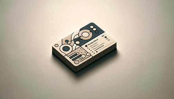
Mistakes You're Making When Designing Your Business Card

Despite the importance of business cards, many people make avoidable design mistakes that hinder their effectiveness. Recognizing these common errors will help you create a card that stands out and leaves a lasting impact.
Common Mistakes in Business Card Design
1. Overcrowding Information on Your Card
It can be tempting to include as much information as possible on a business card. However, overcrowding it with excessive details, such as multiple phone numbers, email addresses, and social media handles, can make it overwhelming and difficult to read. Keep the information concise and focus on the essentials.
2. Choosing Inappropriate Fonts and Colors
The fonts and colors on your business card should be legible and consistent with your brand's visual identity. Avoid using complex or decorative fonts that make it hard to read.
Similarly, choose colors that complement each other and reflect your brand's personality.
3. Neglecting the Back of Your Card
Many business card designs only utilize the front side, leaving the back blank. However, this is a missed opportunity to convey additional information or reinforce your branding.
Utilize the back of the card to add a compelling tagline, showcase your services, or even include a QR code for easy access to your website.
Moreover, consider using the back of your business card to showcase testimonials from satisfied clients. This not only adds credibility to your brand but also provides potential customers with social proof of your expertise and quality of service.
Another creative way to maximize the back of your business card is by incorporating a mini portfolio.
Include a selection of your best work or projects that highlight your skills and capabilities. This visual representation can leave a strong impression on potential clients and make your card more memorable.
Essential Elements of an Effective Business Card

When designing your business card, incorporating essential elements will help maximize its impact and effectiveness. These elements ensure that your card conveys the necessary information while remaining visually appealing.
1. Incorporating the Right Contact Information
Your business card should include the most relevant and up-to-date contact information. Include your full name, job title, phone number, email address, and website. It's important to provide multiple ways for people to reach you, ensuring they can choose the method that suits them best.
Furthermore, consider adding a QR code to your business card. This innovative addition allows recipients to quickly scan the code with their smartphones, instantly accessing your contact information or website. By incorporating this technology, you demonstrate your commitment to staying ahead of the curve and make it even easier for potential clients or partners to connect with you.
2. Selecting a Design that Matches Your Brand
Your business card design should be consistent with your brand's visual identity. Use your brand's colors, logo, and typography to create a cohesive and memorable design. A well-designed card will reinforce your brand's image and help potential clients or partners remember you.
Consider going beyond the traditional rectangular shape and explore unique die-cut designs. For example, if you are a florist, you could have a business card shaped like a flower.
This creative approach not only catches the eye but also reinforces the nature of your business, making a lasting impression on recipients.
3. Using High-Quality Materials for Your Card
The quality of the materials used for your business card speaks volumes about your brand. Choose high-quality cardstock that feels substantial and durable.
Additionally, consider adding finishes such as matte or gloss to enhance the tactile experience and give your card a professional look and feel.
Another option to consider is incorporating eco-friendly materials into your business card. By using recycled paper or sustainable materials, you showcase your commitment to environmental responsibility, which can resonate with environmentally conscious clients or partners.
By incorporating these additional elements into your business card design, you can create a memorable and impactful representation of your brand. Remember, your business card is often the first impression someone has of your business, so make it count!
Tips to Avoid Business Card Design Mistakes

Now that you understand the importance of business cards and the essential elements to include, here are some additional tips to help you create a highly effective and visually appealing business card.
1. Keeping the Design Simple and Clean
A cluttered design can be overwhelming and detract from the card's message. Keep your design simple and clean, allowing for easy reading and visual comprehension. Use white space strategically to highlight key information and make your card visually pleasing.
2. Prioritizing Readability Over Fancy Fonts
While it may be tempting to use fancy or elaborate fonts, readability should always be your top priority. Choose fonts that are clear and easy to read, especially at a smaller size. Remember, your business card serves as a quick reference, so make sure the recipient can easily retrieve and understand your contact information.
3. Making Use of Professional Design Services

If you lack design skills or want a truly exceptional business card, consider hiring a professional designer. They can create a unique and impactful design that aligns perfectly with your brand. Working with a designer ensures a polished and professional final product that will impress anyone who receives your card.
Designing a business card that effectively represents your brand and helps you make lasting connections is a significant undertaking.
By understanding the importance of business cards, avoiding common design mistakes, incorporating essential elements, and following these additional tips, you'll be well on your way to creating an impressive business card that stands out in any networking situation.
When it comes to designing your business card, it's important to consider the psychology of color.
Different colors evoke different emotions and can influence how people perceive your brand. For example, blue is often associated with trust and reliability, making it a popular choice for business cards in industries such as finance and technology.
On the other hand, red can convey energy and passion, which may be suitable for businesses in the creative or entertainment sectors. By carefully selecting the colors for your business card, you can create a subconscious connection with your target audience and leave a lasting impression.
In addition to color, the choice of paper stock can also have a significant impact on the overall look and feel of your business card.
Opting for a high-quality, thick paper stock can convey a sense of professionalism and durability. It can also make your card stand out among a sea of flimsy, generic business cards. Consider experimenting with different paper finishes, such as matte or glossy, to further enhance the visual appeal of your card.
Understanding the Importance of Business Cards

Business cards play a crucial role in professional networking. Despite technological advancements, the physical exchange of business cards remains a tangible and personal way to connect with others. It allows you to establish a face-to-face connection, leaving a lasting impression in the recipient's mind.
Moreover, business cards serve as a representation of your brand identity. It is not merely a piece of paper with contact information but a reflection of your professionalism, style, and attention to detail.
The Role of Business Cards in Professional Networking
When attending conferences, trade shows, or any business event, business cards serve as a valuable tool to exchange information efficiently. They allow potential clients, partners, or employers to easily reach out to you after the event. By having a well-designed business card, you increase the chances of those connections turning into meaningful relationships.
How Business Cards Reflect Your Brand Identity
Your business card offers an opportunity to showcase your brand's personality. The design, typography, and color palette should align with your company's visual identity. A well-designed card creates a cohesive and professional image, leaving a positive and memorable impression on others.
Furthermore, the material and texture of your business card can also contribute to the overall impression it leaves. For example, opting for a high-quality cardstock with a smooth finish can convey a sense of luxury and attention to detail.
On the other hand, choosing a textured cardstock can add a unique tactile experience, making your card stand out from the rest.
In addition, the layout and organization of the information on your business card can make a difference. Consider including not only your contact details but also a brief tagline or slogan that encapsulates your brand's essence. This can help potential contacts remember your business and what sets it apart from the competition.


